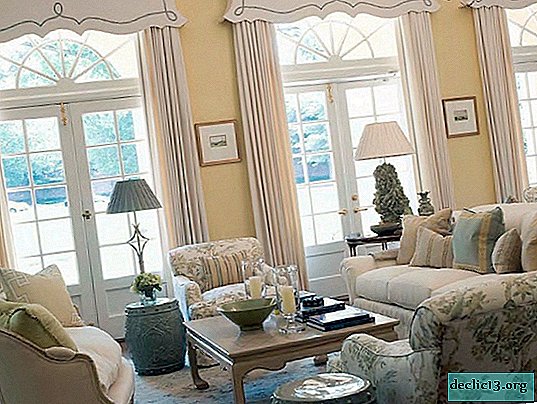
The combination of colors in the interior of the kitchen: spectacular design solutions with vivid examples in the photo
Color in the interior is a key factor in the emotional perception of our surroundings. The correct combination of shades in the kitchen is the key to coziness, comfort, good mood, healthy appetite and emotional communication. The choice of colors depends on many factors: the purpose of the room, lifestyle, age, temperament, the nature of its owners and, of course, on the aesthetic effect that you want to get.


Play with space
Each designer will confirm that color is one of the most effective tools in working with space. Of course, paint manipulations can not be compared with redevelopment, however, competent color design can quite successfully correct the failed geometry of the room. Using light and dark, cold and warm tones, you can create completely unpredictable, impressive illusions. So, by contrasting the dark bottom with the light and light top, you can make the room higher. But if you just swap colors, the effect will be exactly the opposite: the ceiling will noticeably “sit down”.

In a similar way, you can expand or narrow the space. Therefore, in small kitchens, many designers advise using pastel light shades, leaving bright details for emphasis.

And vice versa, spacious rooms fill with rich, bright, deep tones to make them more cozy and comfortable.


Four main color schemes in the interior of the kitchen
Kitchen interiors are chromatic, with a color tone, or achromatic - white, gray, black. Completely achromatic interiors are not practical, since such an environment is considered unfavorable for the emotional state of a person - it can cause depression, apathy and color hunger. But this is not difficult to fix by diluting the background with a dynamic pattern, for example, by laying black and white tiles on the floor in a checkerboard pattern. Another option is to refresh achromaticity with a contrasting expressive accent.

In chromatic interiors, the color palette assumes a multifaceted collection of shades. Having determined the basic tone, you should think about possible combinations to create the perfect harmony of the kitchen furniture.
Of the abundance of color schemes, four main ones can be distinguished:
- monochrome;
- adjacent;
- contrasting;
- triadic (tricolor).
And now more about each ...
Monochrome Kitchens
Monochromatic color schemes involve a combination of different shades of different intensities of the same color. A monochrome interior is by no means boring and monotonous. Correctly choosing textured compositions and colors, you can achieve an incredible effect. White will give rhythm to similar design. An alternative to it can be a glamorous silver. Very dosed, black will look spectacular as a contrast.


To create the perfect monochrome kitchen interior, follow these guidelines:
1. Subordination. To give the kitchen a professional and harmonious onion, one of the shades must necessarily dominate the rest.

2. The combination of different textures. The monochrome interior can be made very elegant and original, using different textures. The most expressive contrast is created using matte and glossy surfaces: ceramics and wood, embossed and smooth wallpapers, matte tiles and glass mosaics.

3. The use of contrasting accents. To refresh the monochrome environment, sometimes one, but noticeable large contrast or a couple of expressive small accents is enough.


Adjacent colors
The kitchen design option, which uses adjacent colors (orange and yellow, blue and green), allows you to create very interesting design solutions. As a rule, one color is dominant, the other is used for accentuation.


Contrast kitchens
A contrast scheme involves a combination of opposing shades, such as blue and orange. The background color is balanced by contrast. This design of the kitchen looks stylish and impressive, but in order not to become boring quickly, it is better to use contrast in a measured manner.

Three-color kitchens
Three colors are combined in the process palette. This composition gives a very bright effect. Perfect harmony is achieved due to the predominance of one color, the rest are used for accentuation.


Good color combinations: finding harmony
The remontbp.com team offers to get acquainted with the most original and fashionable colors this year in the interior design of the kitchen with vivid examples in the photo.
Green cuisine: the atmosphere of spring in your home
Freshness, juiciness and tenderness of spring - these are the associations that cause green and its shades. This color symbolizes wealth, growth and prosperity, perfect for people leading a healthy lifestyle, innovators and experimenters. By the way, green promotes fast saturation and proper nutrition. As for color combinations, it is in perfect harmony with white, red, yellow, gray, brown. And in a duet with wood tones and textures it creates the perfect backdrop for eco-friendly interiors.


Blue kitchen: marine mood of the interior
Refreshing, relaxing, airy blue is not the most popular option for kitchen facilities, but it does not become less original. Moreover, the blue kitchen with a limited area seems visually larger. The main thing is to correctly combine and dose this color. The optimal combinations are as follows:
- equivalent contrast with white;


- expressive dosed accent of blue and its shades;

- a tricolor composition of blue, white and gray, where white is the background, and blue and gray serve as a diluting decorative color element;

- combination of blue with basic neutral shades;


- bright accents of other colors in a very metered ratio to blue.

Brown cuisine: a noble palette of color combinations
Brown creates an atmosphere of home comfort and warmth with a hint of hot chocolate, gives confidence and peace of mind. Such a kitchen always looks elegant, modern, elegant. A win-win version of all kinds of combinations of shades of brown - milk, beige, coffee, etc. Brown and lilac look rather unusual, definitely beautiful - with green.


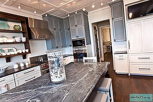
Trendy gray kitchen.
Ideal for those who like classic motifs, but daring black and white contrasts are too much. Gray is a kind of intermediate option and at the same time very versatile, practical and very relevant today! This color will make the perfect company for any other as a base or accent.


Black and white kitchen: stylish classic of contrasts
Black and white interior is a sign of elegance and style of your kitchen space. But in this case, the correct color proportions are important. Do not forget about the bright impregnations that will give the interior completeness and a kind of charm.


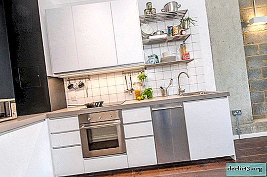
White kitchen - clean background for colorful accents
White color is not the most practical for the kitchen, but the most favorite by designers. This is a kind of clean background on which you can realize your creative ideas. The white kitchen is the perfect solution for a compact space. This color pushes the boundaries of the room, gives it airiness, lightness, gives a feeling of freedom.


Yellow kitchen
What associations causes yellow? Of course, this is the sun, happiness, joy, optimism. The kitchen in yellow is like an island of enveloping comfort and warmth in your home. Of course, background yellow is too much, but as a complementary contrast or bright accent, designers are actively using it to create original stylish interiors. Combine yellow with white, gray, brown, beige, black - you will not lose!


Appetizing orange in color design
A kitchen with orange colors is suitable for people who are cheerful and confident. To prevent this color from becoming annoying, it is important to remember some rules:
- orange furniture will not tolerate nearby walls and floors in the same color;
- orange always looks win-win against a background of neutral pastel and base colors;
- Milk, yellow, and ivory are combined well with orange. But the best complement orange furniture is blue, purple, purple and blue.


Red cuisine: vibrant color experiments
Modern design in the red palette is rapidly gaining popularity, including in the design of kitchens. Red looks harmoniously next to gray, white and black.


Fascinating purple in the kitchen
In an interior with violet elements, creative personalities, dreamers, practicing meditations and various spiritual practices will feel comfortable. The main thing in design planning with purple is the measure.


 In general, “right” or “wrong” colors, as such, do not exist. Any palette that does not contradict your taste preferences is appropriate. When choosing a color, consider its properties and try to predict the effect that it can create in the room.


Watch the video: Latest Modular kitchen designs 2017AS Royal Decor (May 2024).

-
Chanterelle mushrooms, porcini, oyster mushrooms - step-by-step cooking recipes
Mushroom dishes belong to the place of honor in Russian traditional cuisine, so in the article I will tell you how to cook chanterelles, oyster mushrooms and white. Surely there are many beginning cooks who are interested in the answer to this question. From ancient times, mushroom dishes were prepared in Russia. They were boiled, fried or stewed with herbs and vegetables, prepared for the winter. ... -

-
-